Problem
How can I design a simple, scalable design system that's clear for both designers and developers?
The Challenge
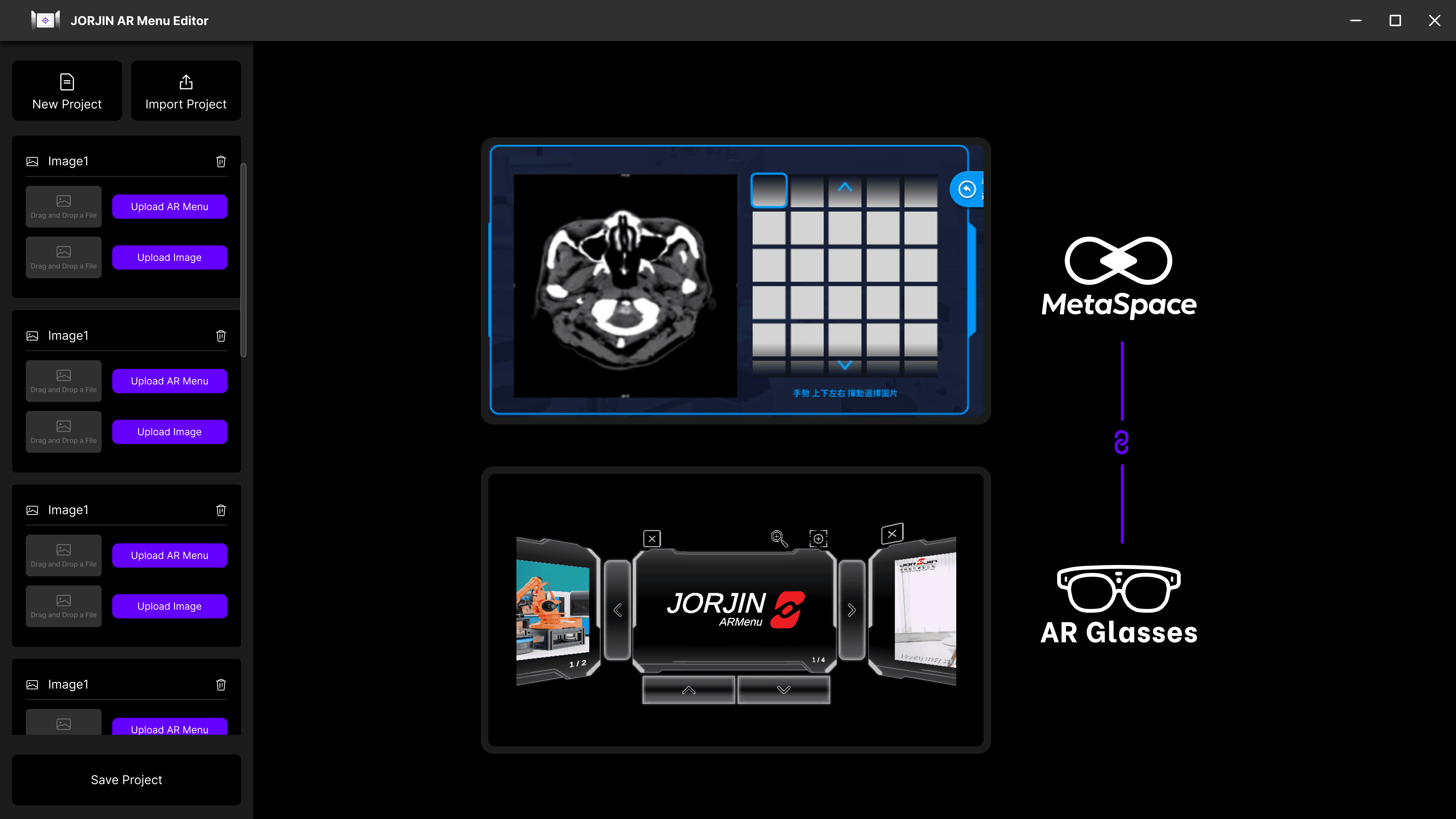
Previously
Past projects were limited to the Proof of Concept (PoC) stage.
Designs lacked consistency across PoCs.
Design documentation and component organization were lacking.
Upon designer joining the team
Redesigned and adjusted product flow and visual elements.
Established a design system during the design process.
The Design System would be
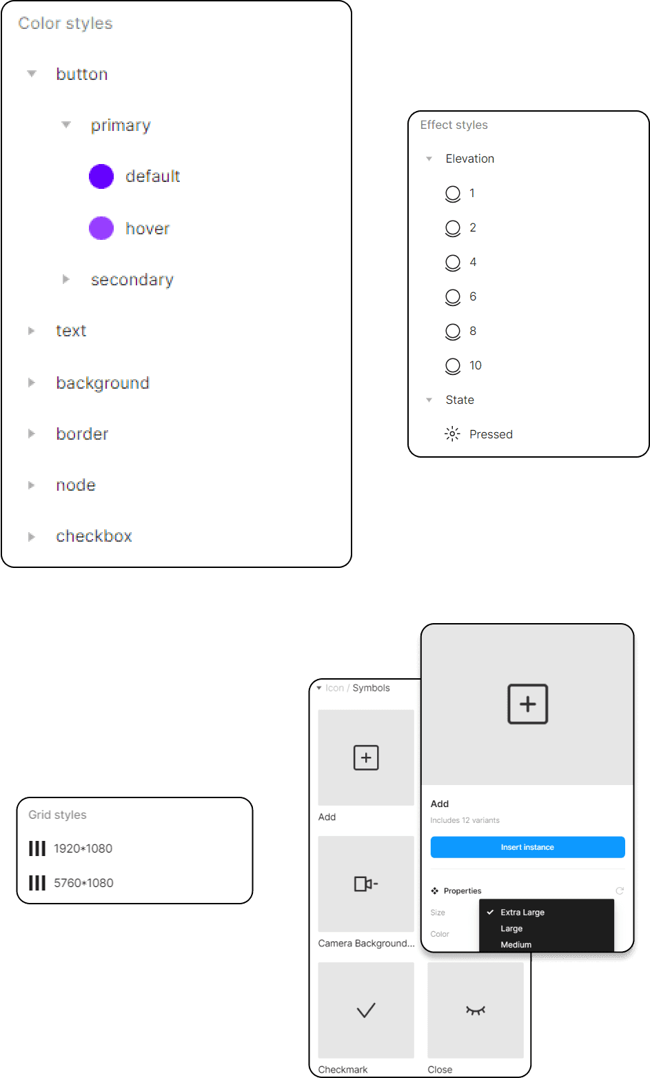
Adhered to atomic design principles to ensure scalability.
Utilized nested components and component properties to simplify variants.
The Advantages
Centralized Resource
A unified platform for accessing components, patterns, and styles.
Scalable Redesign
Effortlessly manage and redesign new changes across projects on a large scale using the design system.
Rapid Replication
Quickly replicate designs by leveraging pre-made components and elements.
Time Effciency
Decrease wasted time in design and development due to miscommunications.
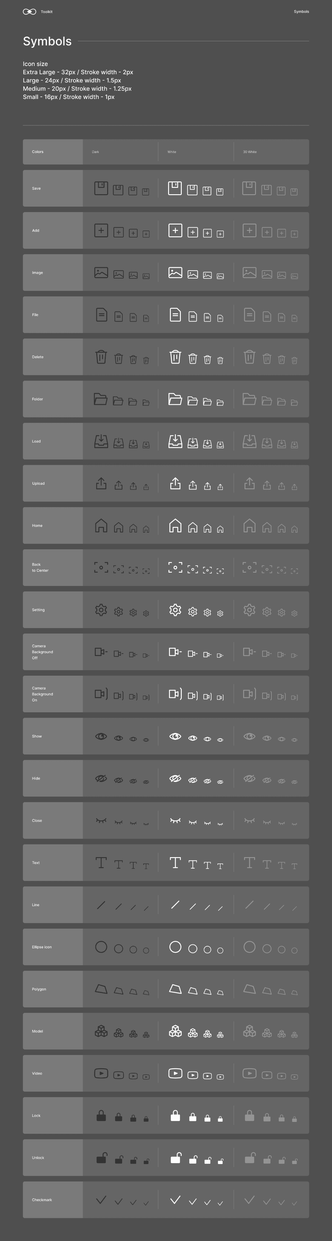
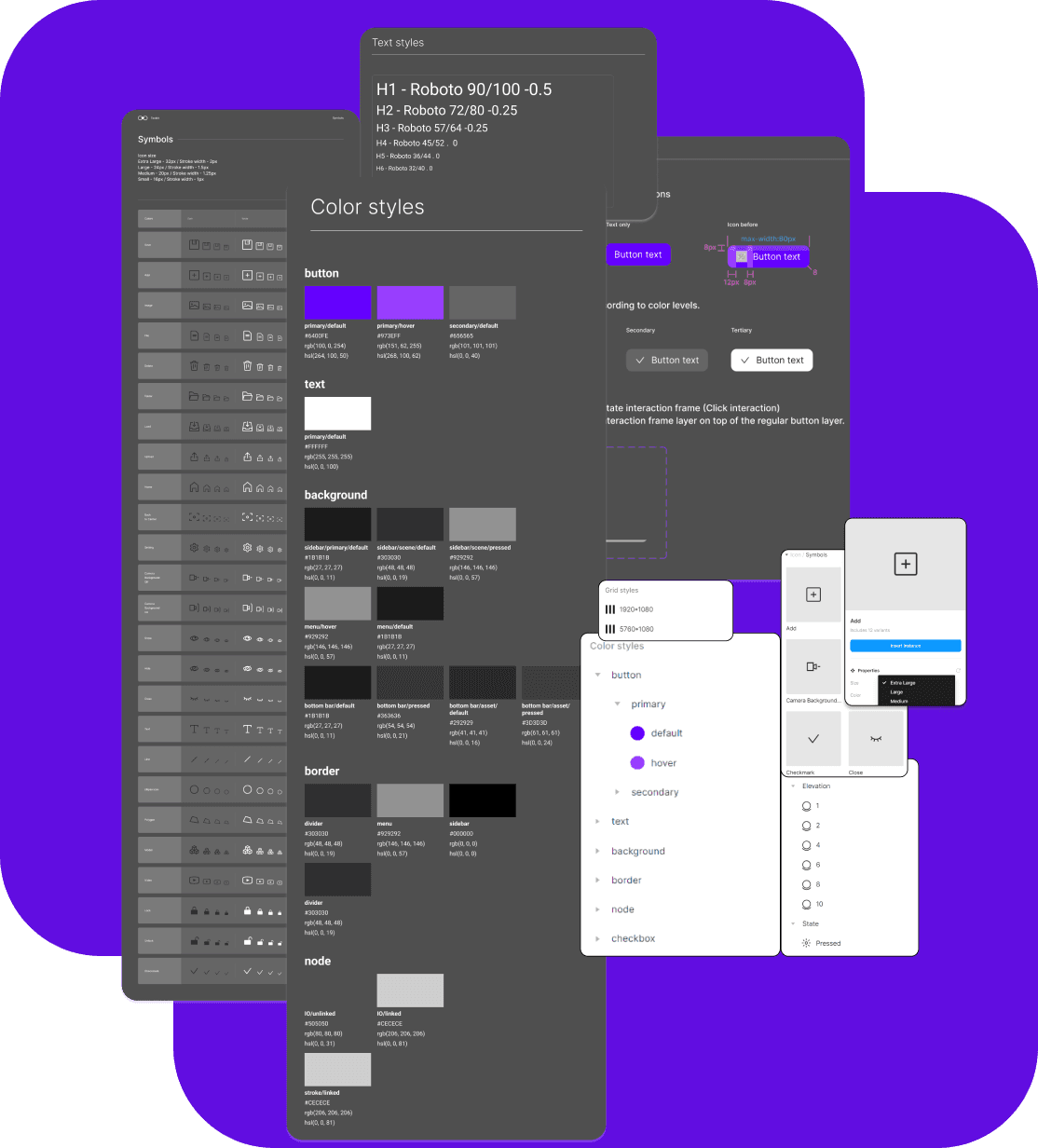
During the redesign process, we initiated by establishing a style guide for the system.
The style guide consisted of
Branding
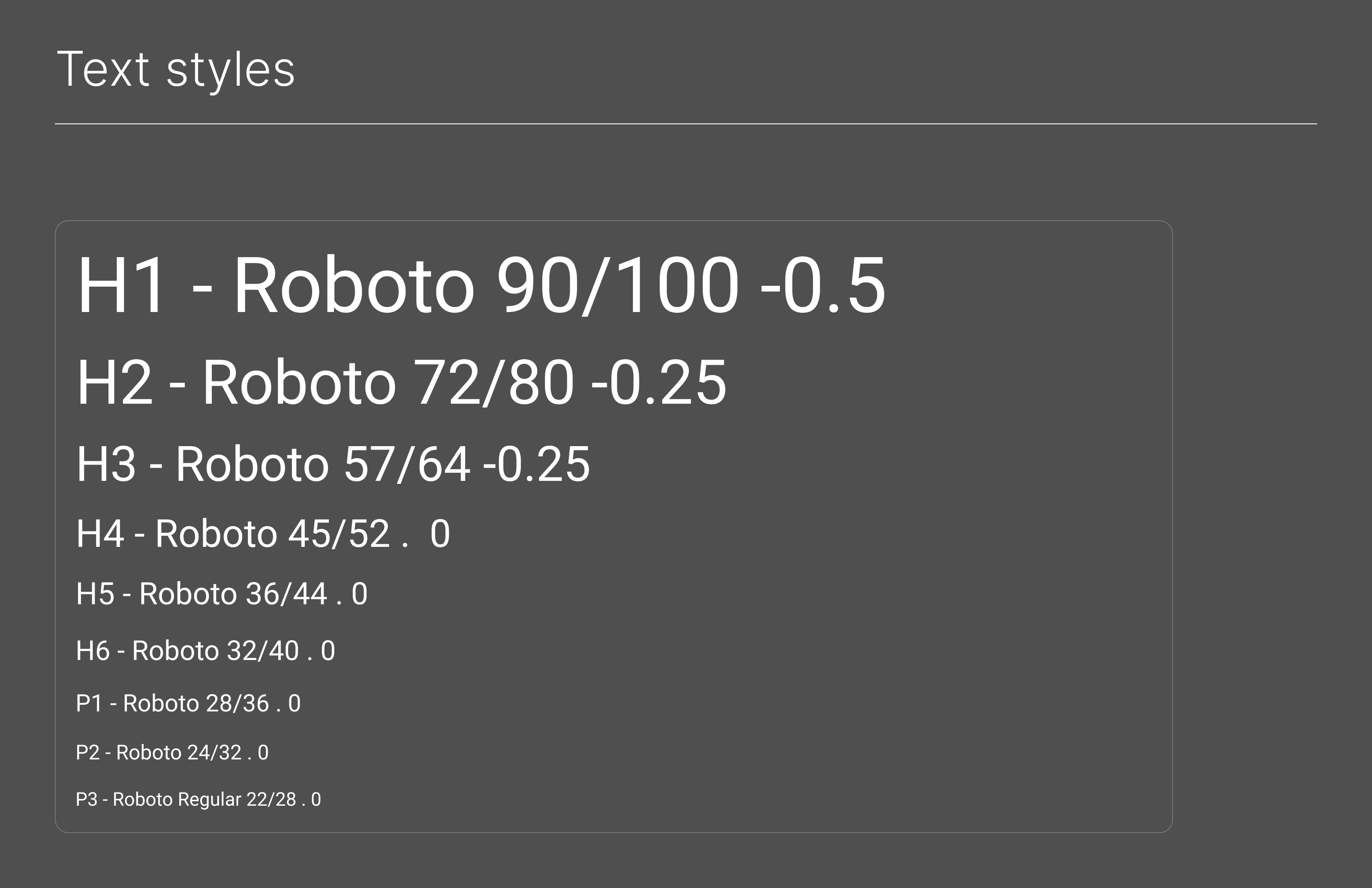
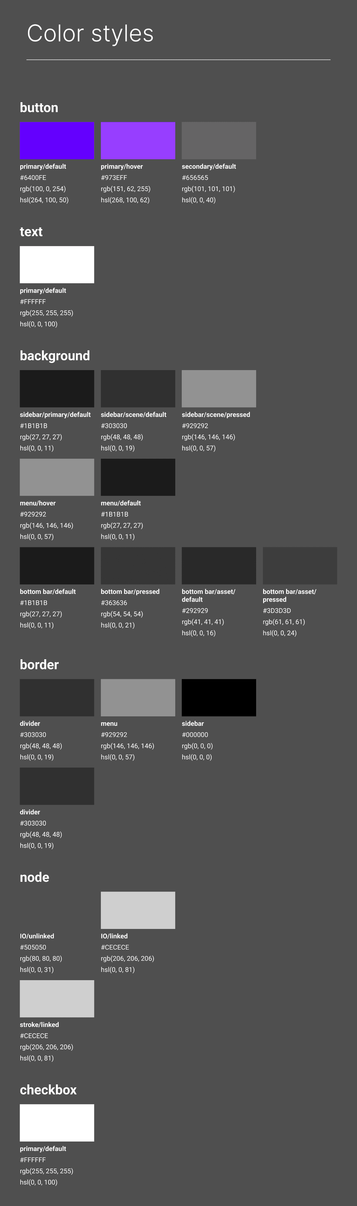
Design Tokens: colors, typography
Spacing
Layout grids
Icon
Border, Radius guidelines
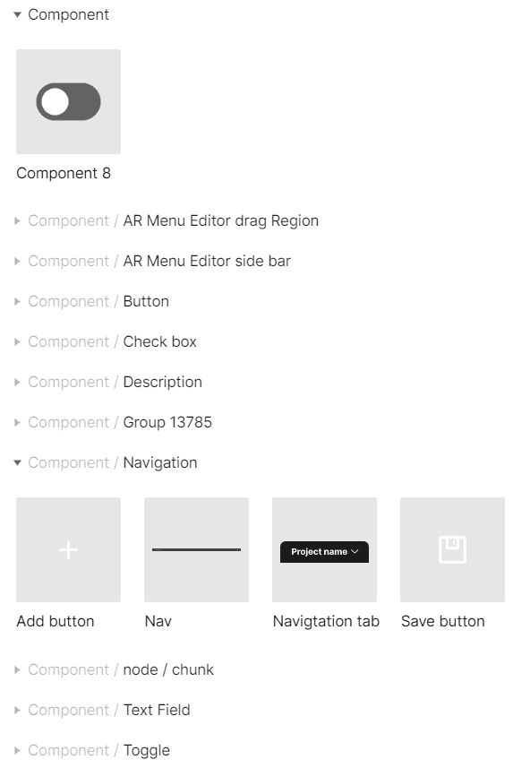
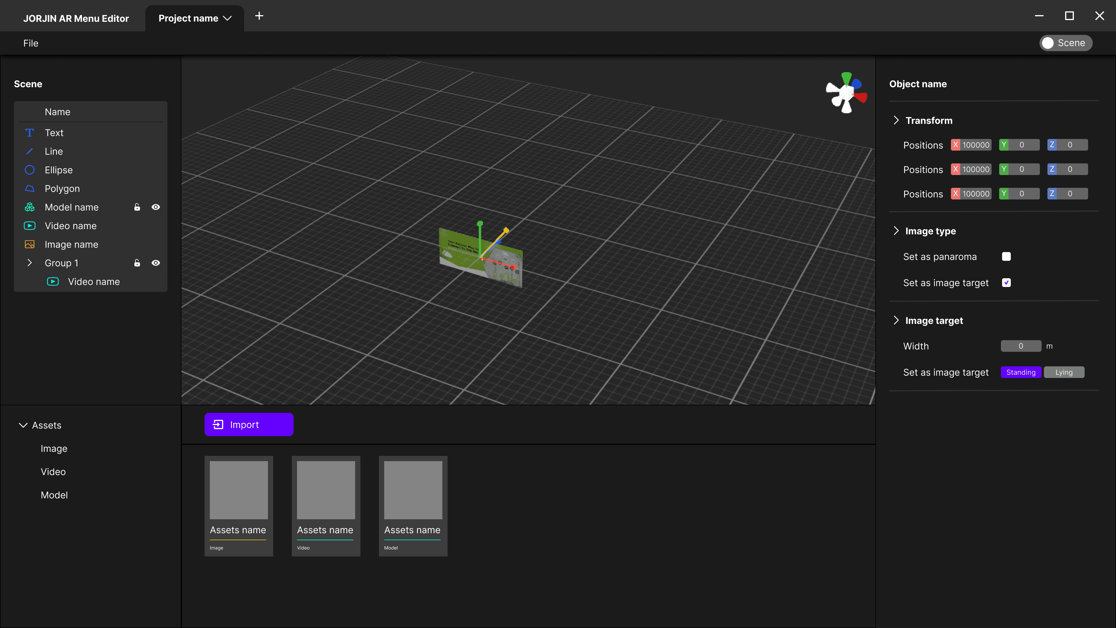
Developing this library involved identifying common components utilized across projects and anticipating any potential new components required in the future.
The component library
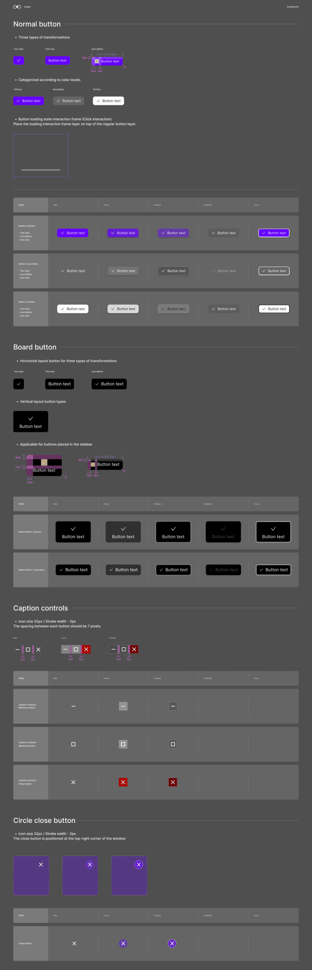
Component Identification
Distinct and precise UI component names to prevent any misunderstandings between designers and developers. Clarity in naming ensures seamless functionality without errors.
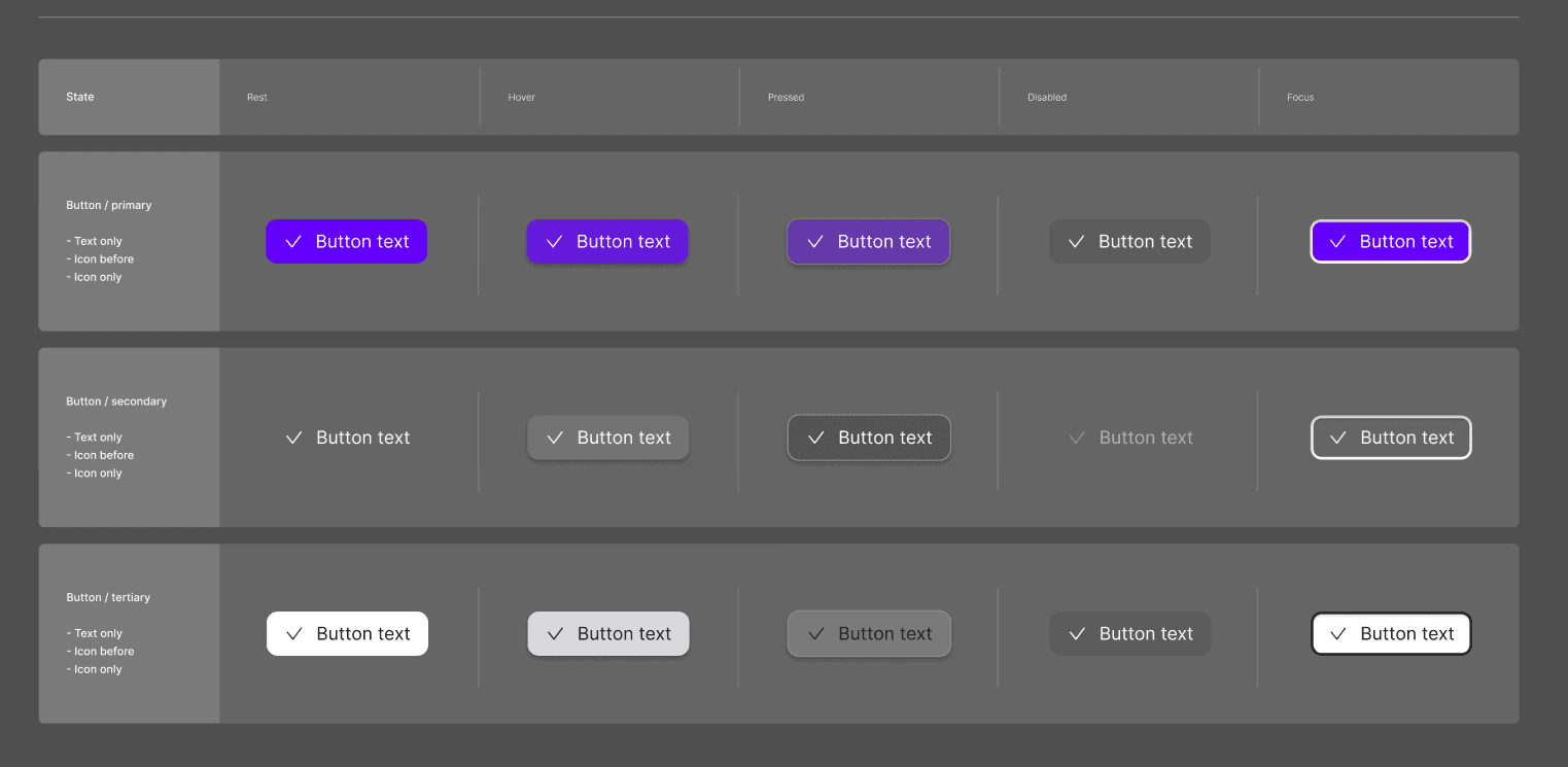
State Transitions
Default recommendations and visual alterations for different states.
Documentation
Annotations and detailed descriptions on pages to facilitate understanding of each component.
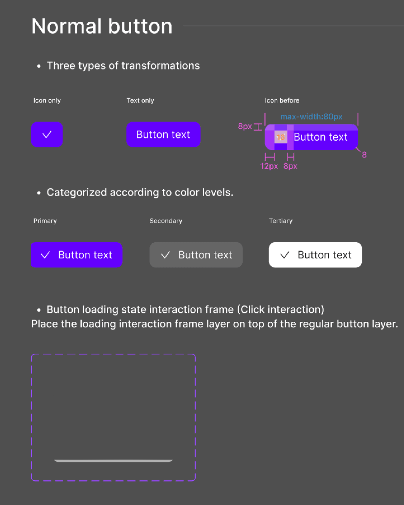
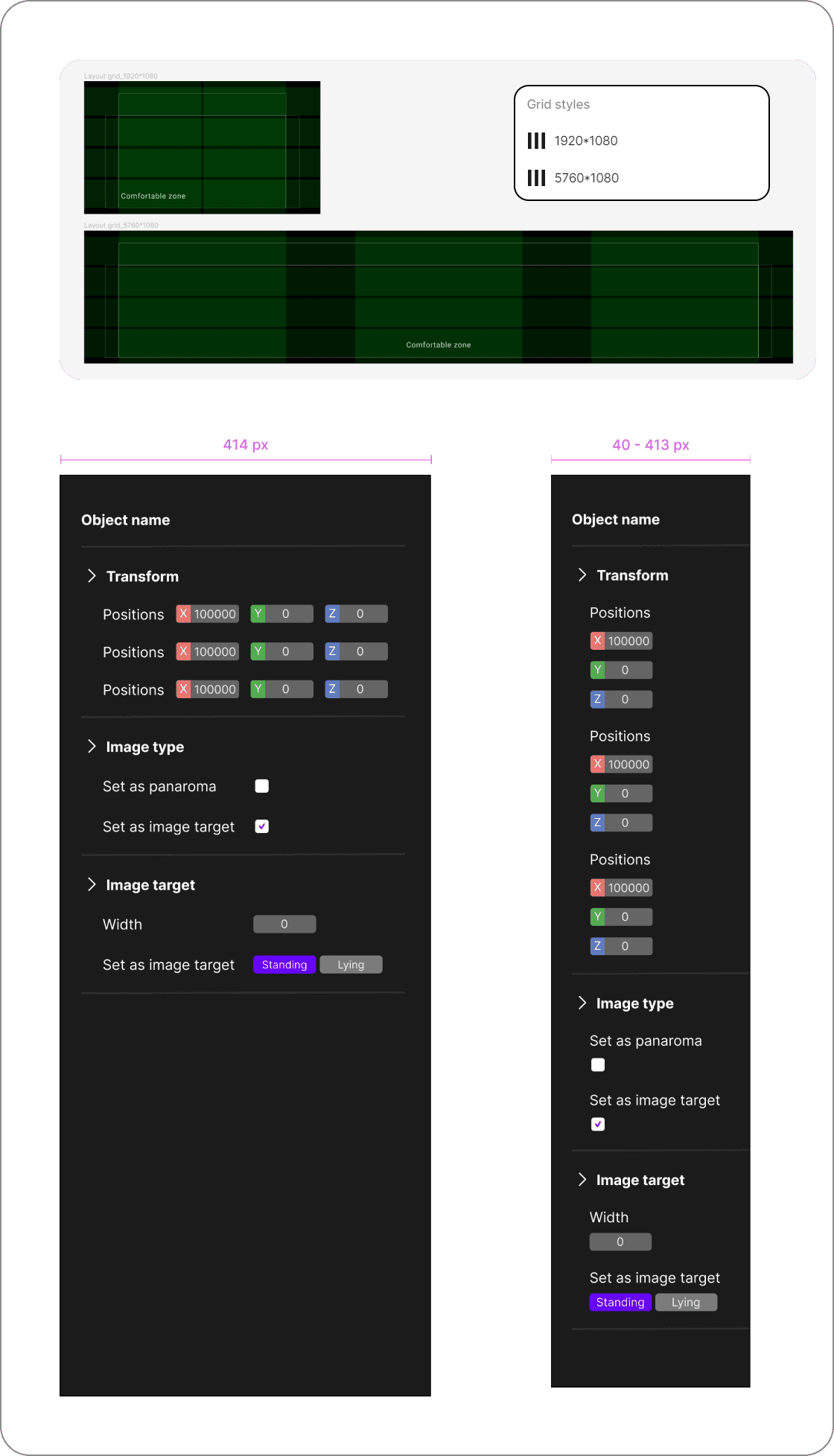
Responsive Design Guidelines
Size indications and breakpoints provided for developers to ensure responsiveness across various devices.