An entry system for an AR experience
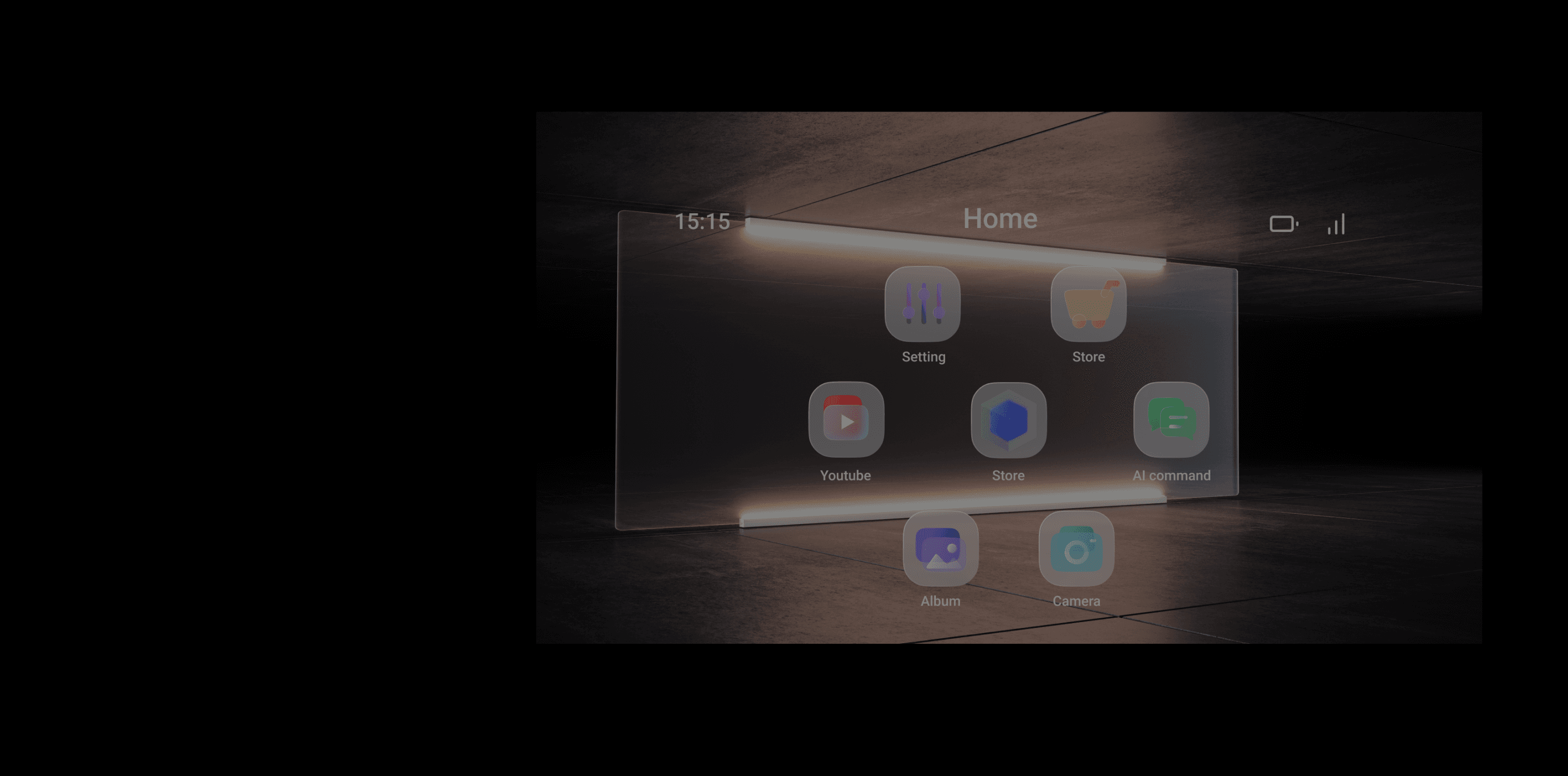
AR Hub
Current AR glasses’ interaction face the following challenges.
Users do not understand how to use AR glasses easily.
AR glasses are a new and emerging technology. Unlike traditional smartphones or computers, users need to spend time and effort to learn how to use them.
Products lack an unified human-computer interaction method
AR glasses applications are still in their early stages of development, with a limited number of applications available and scattered across different platforms.
In addition, the operation methods of different applications vary greatly, lacking a unified standard, which requires users to relearn when using different applications.
Define
Users need to know how to
Perform gestures.
Exit apps at any time to ensure users’ vision.
Adjust the basic settings of the glasses and controller.
Find a menu of downloaded AR apps from other developers.
The user interface should
Be easy to use and memorize.
Avoid frequent switching between the glasses and the controller.
Seamless switch between glasses and the controller.
It’s crucial to make the AR Hub should be the entry point and the base of AR glasses experience.
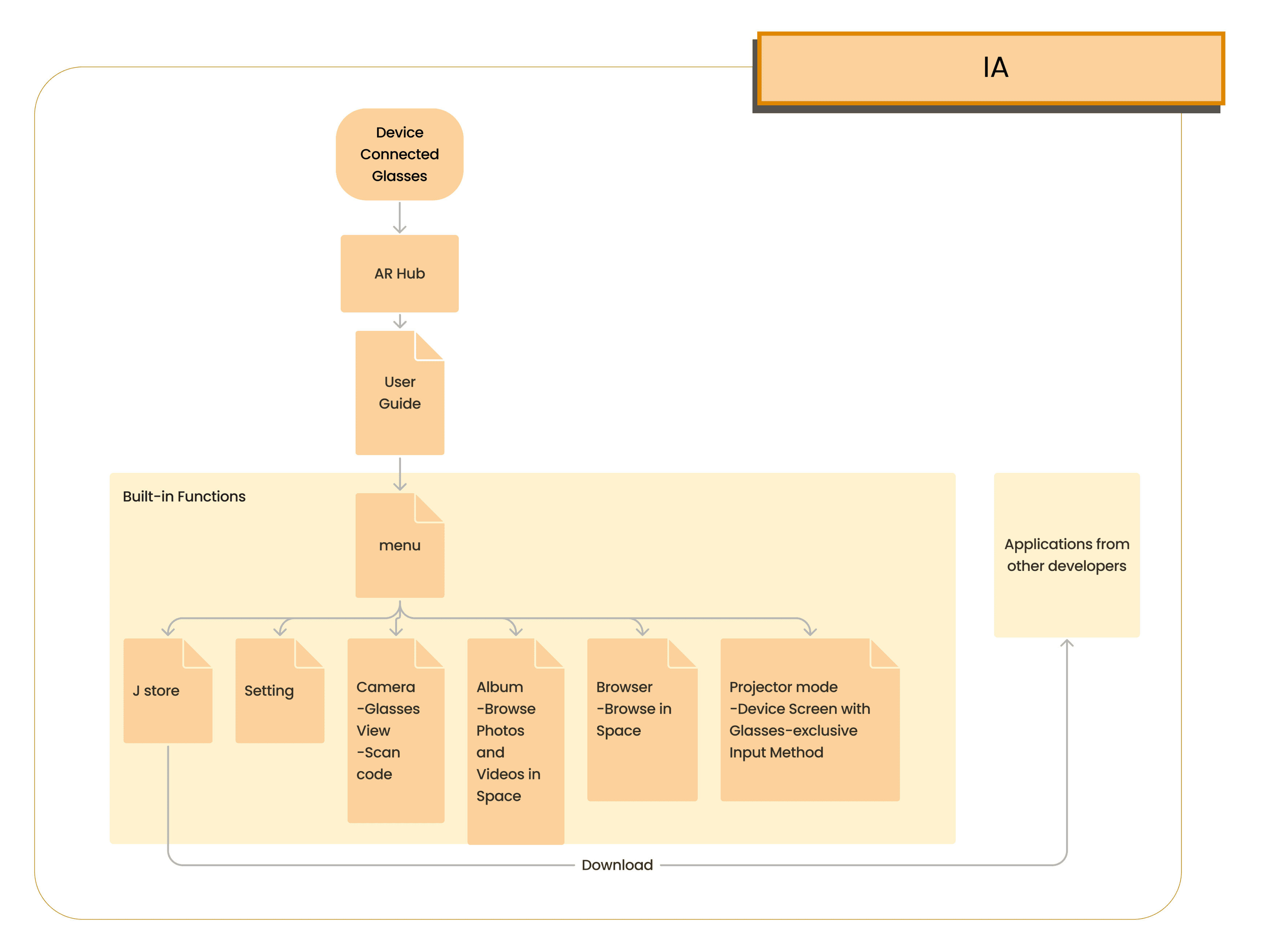
Information Architecture
User Guide
Eliminate the need to frequently switch between the glasses and the handheld device.
Unify the way users interact with the glasses (physical to virtual).
Serve as an entry point in the information architecture to connect to AR apps developed by various developers.
Showcase the experience brought by hardware components through built-in functions..
Built-in Functions
Familiarize users with the interaction mode of the glasses GUI through the operation of the entrance.
Emphasize the integration of virtual and reality, and the application of interactive elements.
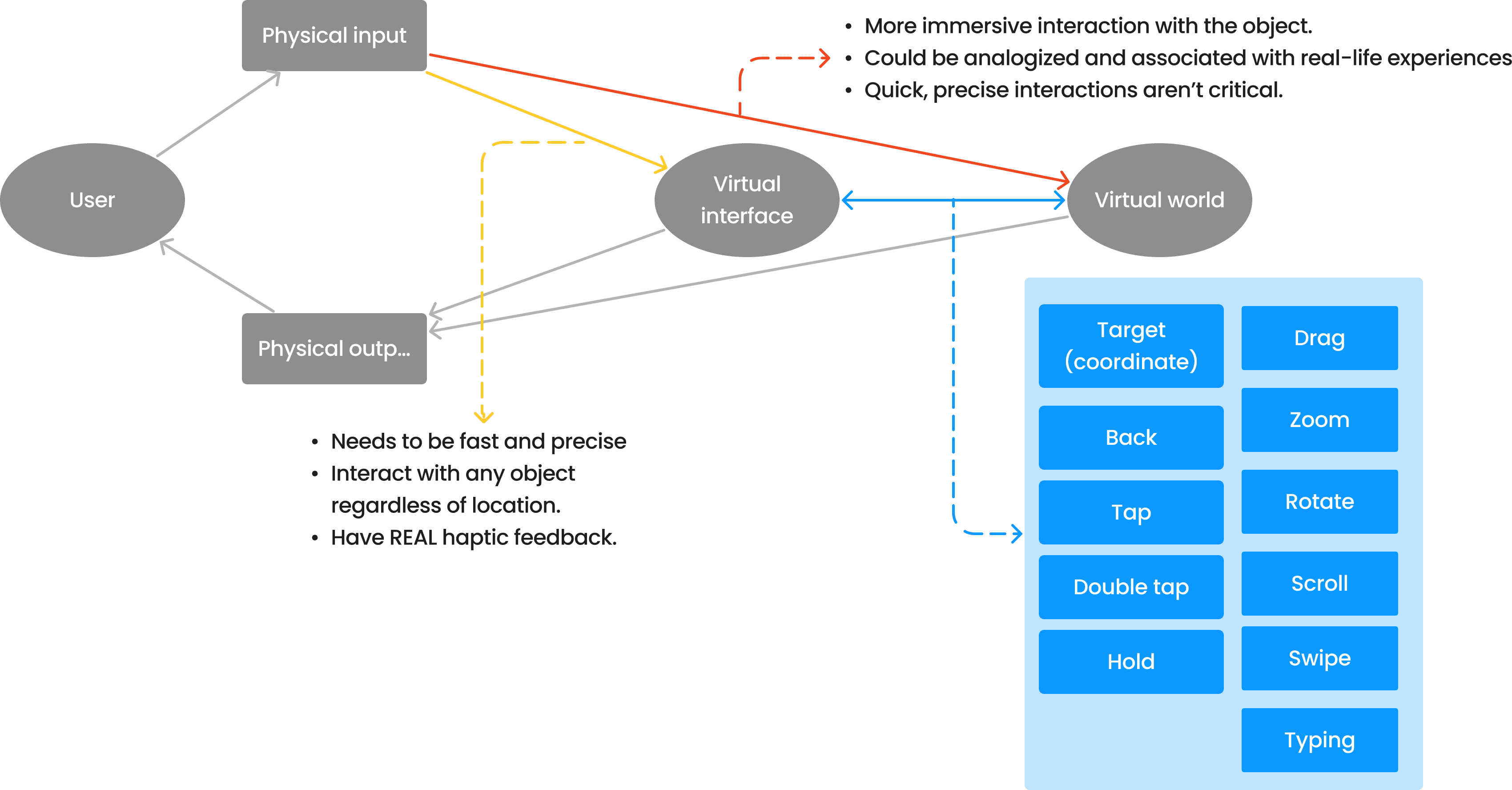
Interaction with virtual interface

The Art of Game Design: A Book of Lenses, Third Edition.
Defines how physical inputs are related to virtual inputs.
The User FLow
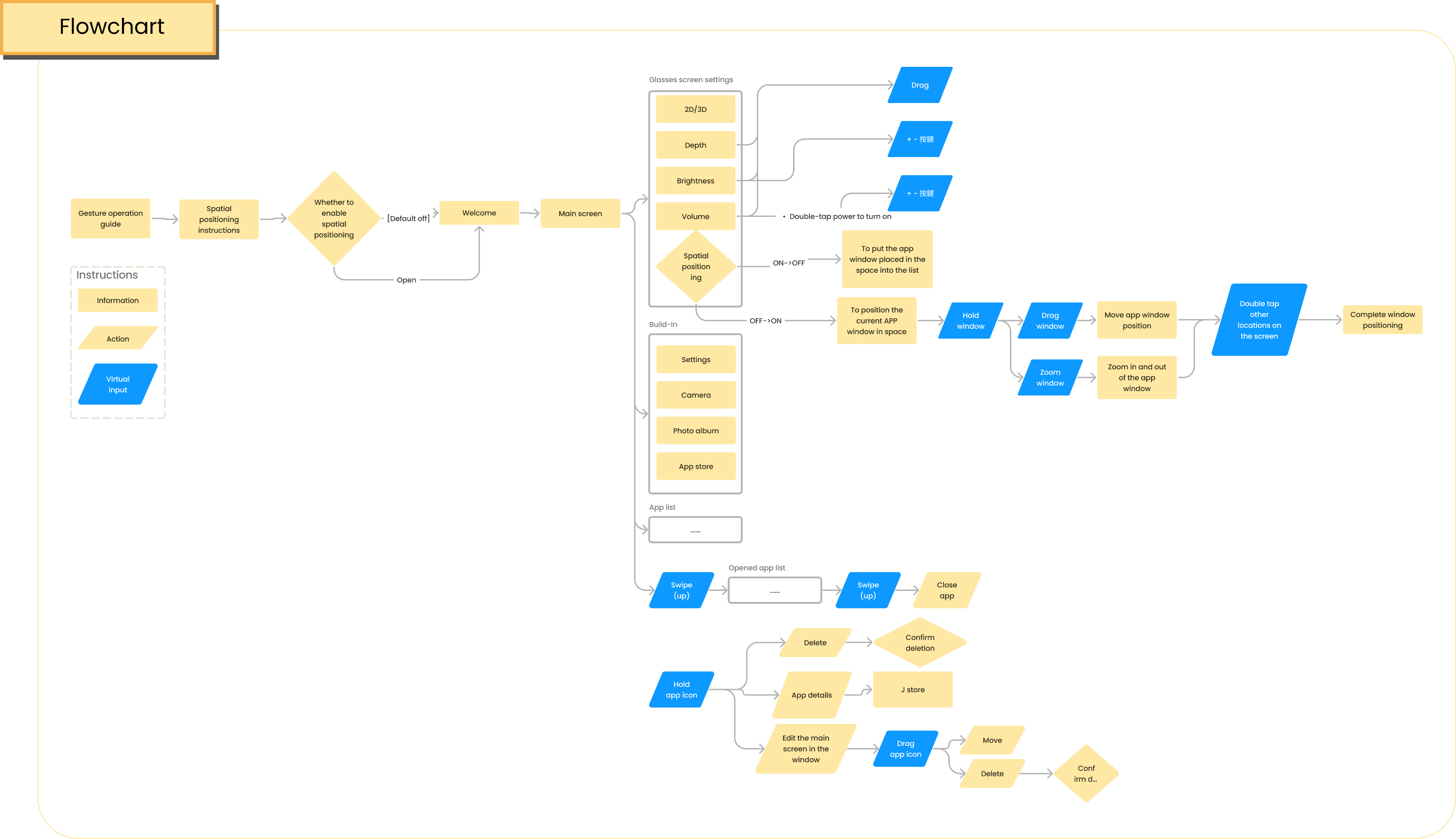
The entrance for user to AR experience, and the bridge between AR apps.
Relationship between ergonomic and interface
Considering the hardware conditions of AR glasses
AR glasses have a limited field of view, and the position of the glasses image is determined by the optical engine. This means that the position of the glasses image will affect the user's viewing direction.
The layout on the UI also needs to consider Hardware factor
If the interface elements are placed too close to the edge of the field of view, it will put too much strain on the eyes.
If the focal length of the hardware optical engine itself is too close, the interface elements need to be adjusted to help the user focus and view correctly.
Wireframe
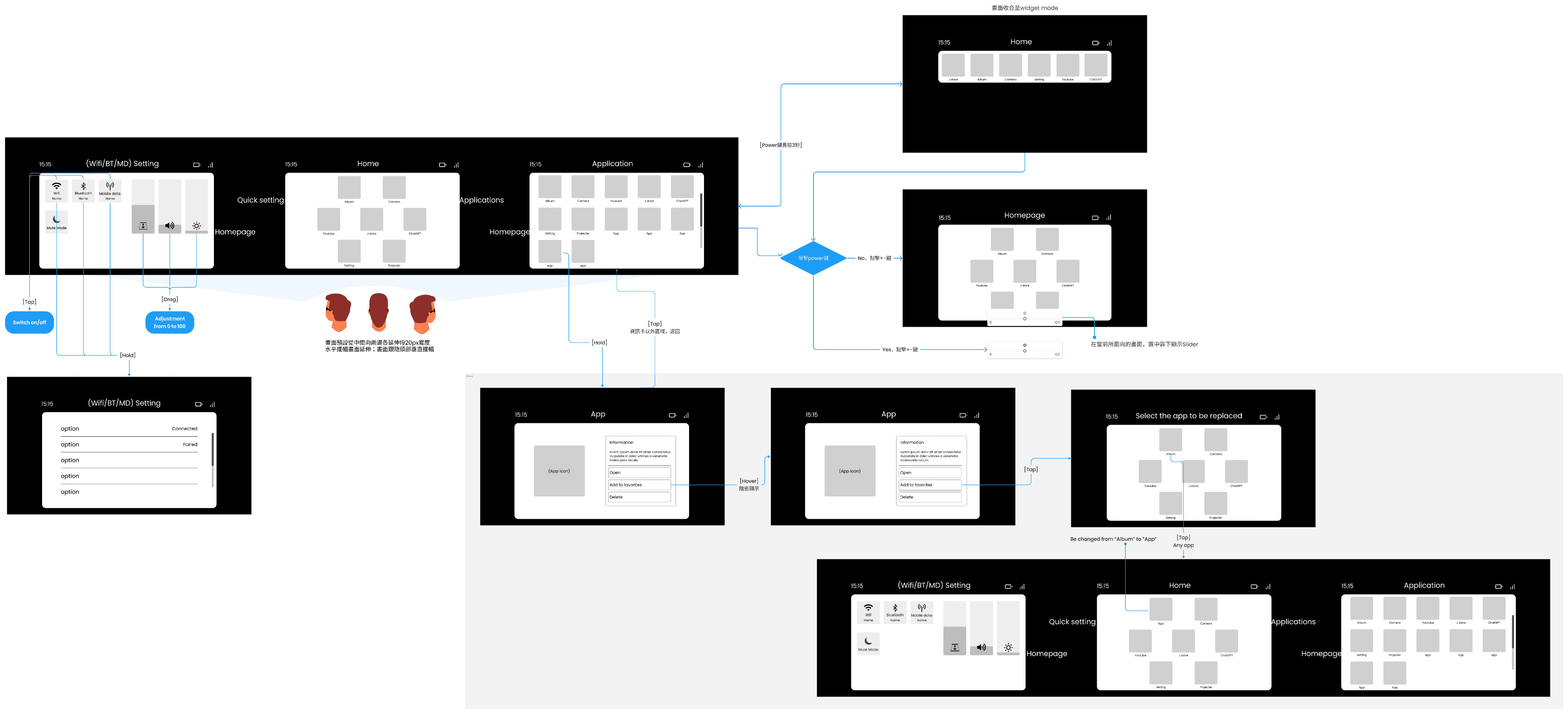
Defines which flows and layout are triggered by which virtual inputs.
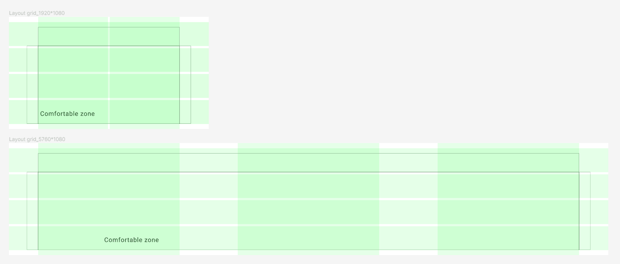
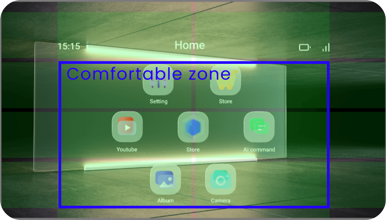
After testing the Field of view(FOV) of AR glasses optical engine, we define the comfortable zone of this AR glasses and build grid style in design document.
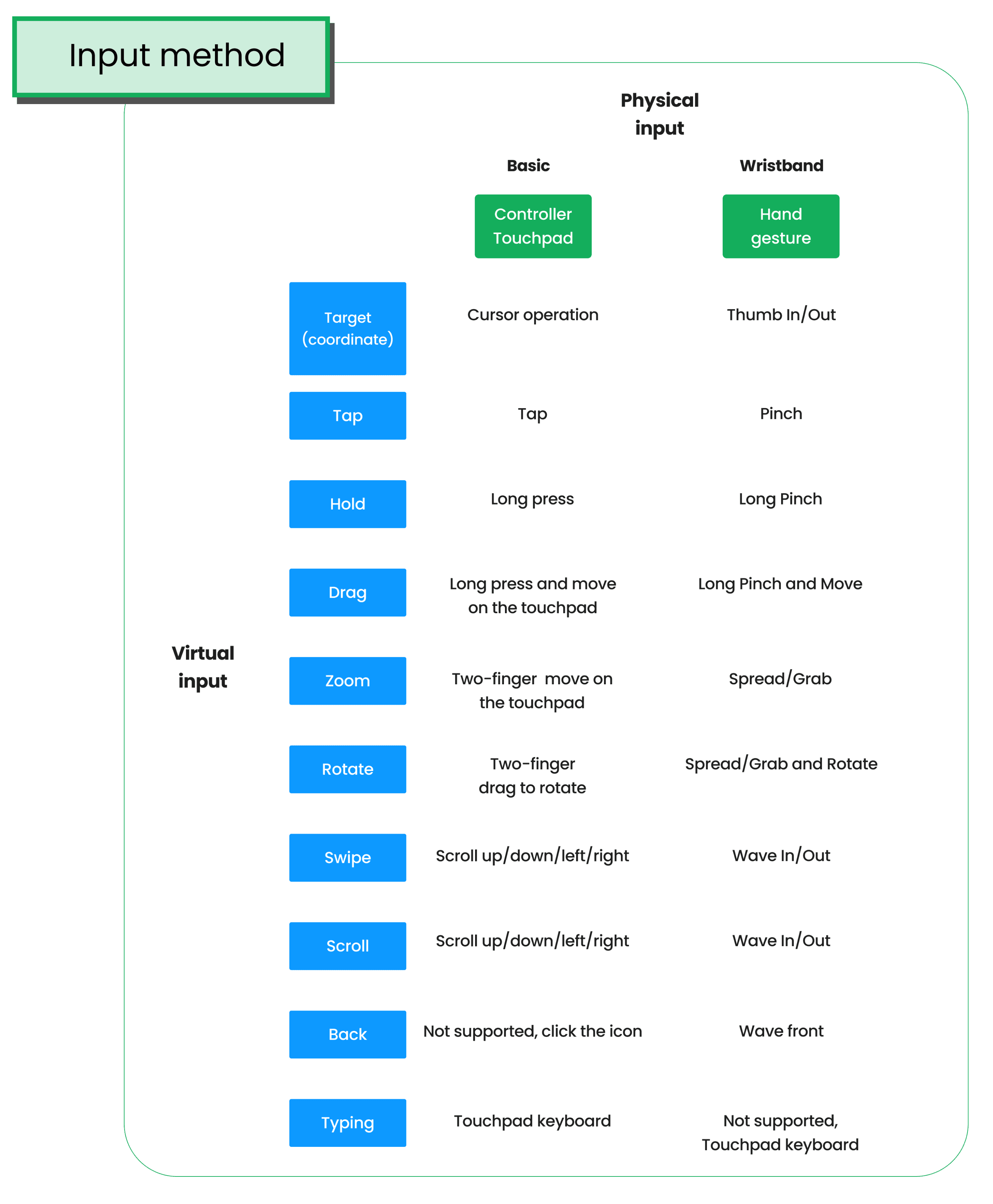
The basic physical input method
0.1 Controller_Touchpad
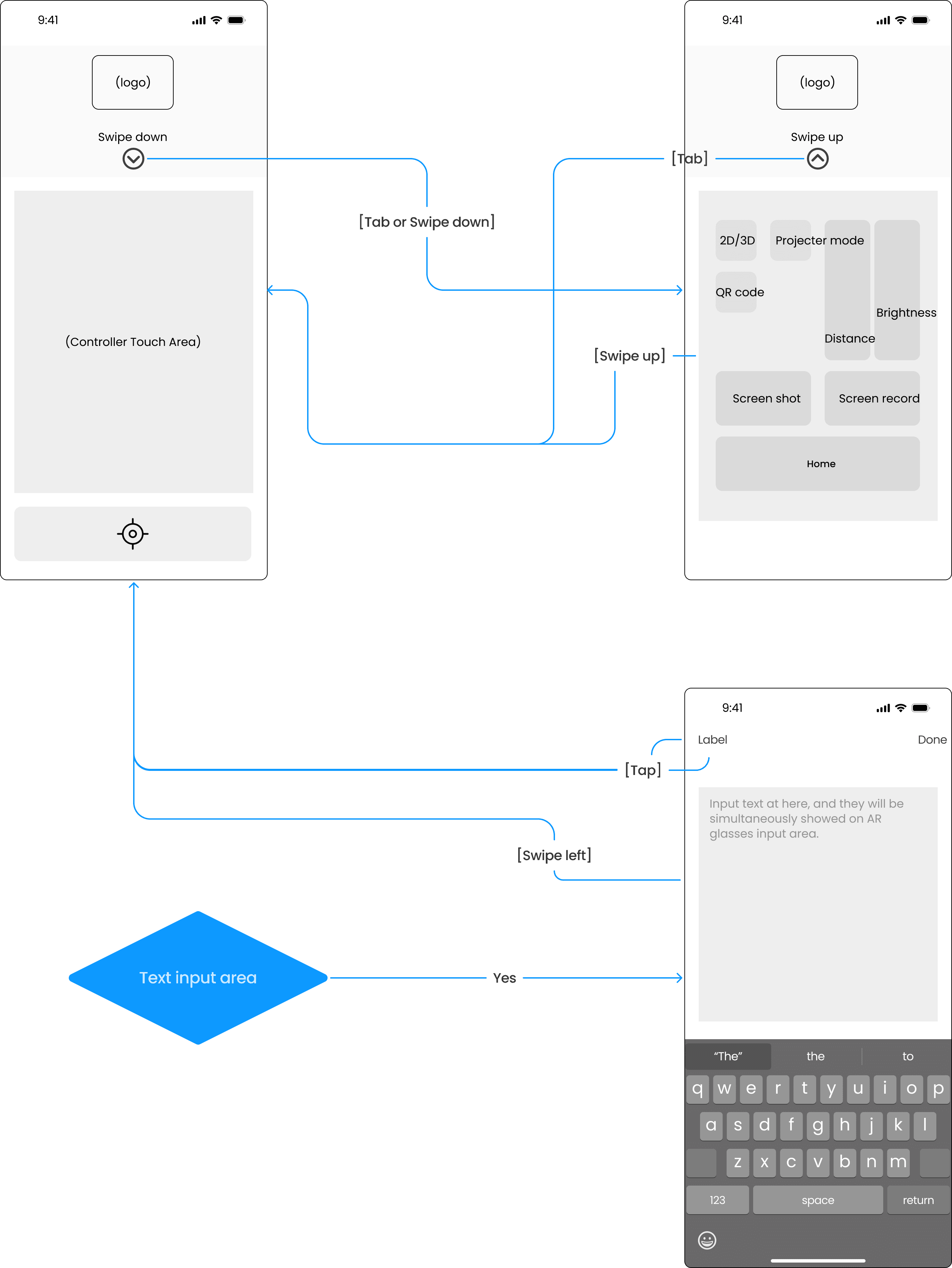
1.1 Glasses_HomePage
User Interface
UI Design principles:
After conducting secondary research and testing our own AR glasses hardware, we have identified the following key points for designing our own glasses interface.
Color:
Black color in AR glasses will be showed in transparent.
Avoid using opaque colors in a large area.
Typography:
Strive to maintain a minimum font size that most people can read easily.
Prefer Medium, Semibold, or Bold font weights, and avoid Ultralight, Thin, and Light font weights.
Position and shape:
Avoid using shapes with sharp edges. When you use sharp edges, your eyes tend to focus on the outside, which reduces the accuracy of your eyes.
Keep the primary content of your application centered in the viewport, which is the area of the screen that is most comfortable for your eyes.
Human Interface Guideline, Apple
ARCore, Google
Considering above principles, we chose UI style with:
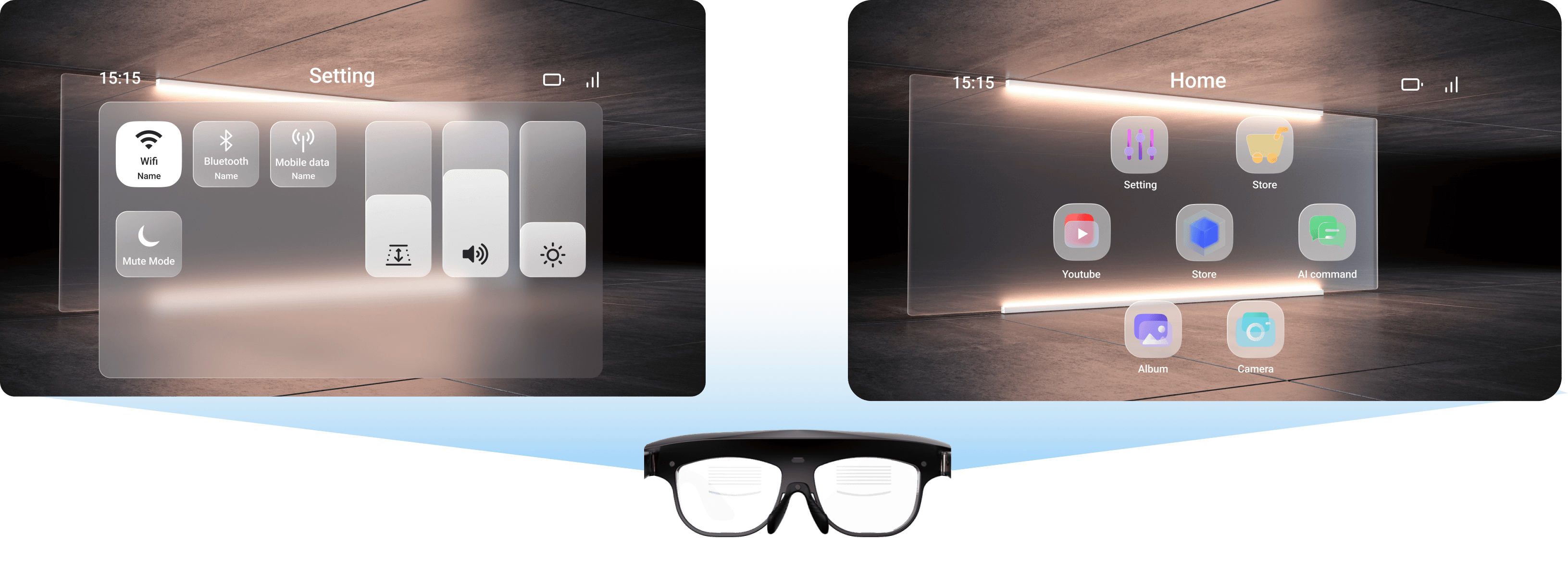
Glassmorphism style
Use a translucent background to separate the subject from the real world. This will emphasize the subject and allow users to see through to the real world to avoid occlusion and danger.
Provide different depths for different information levels.
Use rounded corners to reduce screen sharpness and improve user focus.
Use the same frosted glass material for the background and border to make the screen more unified and reduce the color difference between subjects that are too different, which has the effect of neutralizing the screen.
Follow up UI validation items:
The UI planning of Augmented Function
Comfortable viewing range of UI on hardware?
Component size specifications?
Minimum font size?
Component opacity?
Physical button combinations?
How far apart should they be to avoid mis selection?
How to set the focal length of the optical projection?
Convenient ways to operate the glasses interface during stationary and moving use?